✨ Let’s get into it ✨
⏱ 2 min read
💡 TLDR
Forget boring neutrals—NYFW just served a massive dopamine hit with high-voltage color blocking! We're talking red and blue power duos, saturated blues paired with pink, and the absolute showstopper: yellow mixed with leopard print.
The era of boring neutrals is officially over because New York Fashion Week just proved we are all collectively craving a massive dopamine hit. After Dario Vitale’s Versace collection set the stage for rethinking primary colors last season, the Spring/Summer 2027 shows turned the volume all the way up. From Michael Kors Collection’s retro vibes to Campillo’s delicious hyper-color explosion, the runways were pure, saturated joy.
Bold Pairings And Primary Power
If you want to know what’s going to be everywhere, look no further than red and blue. This was easily the unavoidable pairing of the week, showing up most effectively at Tory Burch and even dominating the front rows. It’s the perfect move for anyone who wants to play with bold tones without looking like a literal cartoon character. Another major vibe involves mixing blue with orange and pink. To make this work, the specific shade matters; you need an ultra-saturated royal or Yves Klein blue to really let those other hues pop against it. Choosing complementary textures really makes this one sing. We saw this texture play go hard at the Ossou presentation and in the all-silk looks from Campillo.
💫 Choosing complementary textures really makes this one sing.
High Fashion Earth Tones And Prints
For my girls who prefer something a little more grounded, green and blue are having a serious moment. Whether it’s a ladylike approach at Tory Burch or something totally relaxed like Rachel Comey, these cool tones are endless. You can even spice things up by layering a patterned piece, like a floral green skirt with a blue blouse. Yes, this is basically the Target employee uniform combo, but don’t let that scare you—the high-fashion version is all about well-cut pieces like the simple coats seen at Michael Kors Collection and killer accessories.
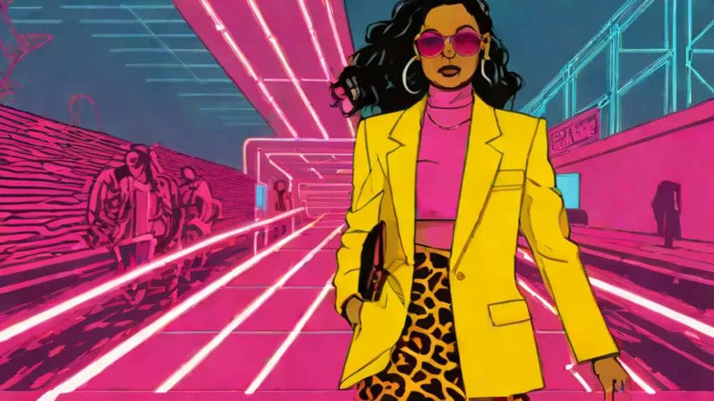
There was also one standout moment from Proenza Schouler that changed everything: pairing yellow with leopard print. Since we all know leopard is basically a neutral, this combo felt incredibly fresh. The trick is to find an animal print with browns that complement rather than fight the yellow, and keep the yellow light instead of banana-colored. It was such a captivating look that I actually stopped mid-runway walk just to process how good it was.
Which of these color combos would you actually dare to wear in real life?
❓ People Also Ask
What are the trending color combinations for NYFW SS27?
The trending color combinations for the Spring/Summer 2027 season include bold pairings like red and blue, as well as blue mixed with orange and pink. For those preferring more grounded looks, green and blue are also making a major impact on the runways. Additionally, a standout trend involves pairing yellow with leopard print. These saturated combinations signal a shift away from boring neutrals toward high-energy, dopamine-inducing fashion choices seen throughout the New York Fashion Week collections.
How can you successfully style blue with orange or pink?
You can successfully style blue with orange or pink by using an ultra-saturated shade like royal blue or Yves Klein blue to make the other colors pop. It is also important to incorporate complementary textures to elevate the look and prevent it from feeling flat. This strategic approach to texture and saturation was demonstrated during the Campillo all-silk looks and the Ossou presentation, proving that specific shade selection is key to mastering these bold, high-fashion color blocks.
What is the best way to wear leopard print with yellow?
The best way to wear leopard print with yellow is to pair a light yellow shade with an animal print that features complementary brown tones. Avoiding a heavy banana-colored yellow helps keep the look fresh and sophisticated rather than overwhelming. This specific combination was highlighted by Proenza Schouler, treating leopard print as a neutral base that allows the vibrant yellow to stand out. Success depends on ensuring the tones of the print and the color do not fight each other.
How can green and blue be styled for a more grounded look?
Green and blue can be styled for a grounded look by utilizing cool tones in well-cut pieces or through thoughtful layering. One effective method is to layer patterned pieces, such as pairing a floral green skirt with a blue blouse, to add visual interest. This approach works for both ladylike aesthetics seen at Tory Burch and more relaxed styles like those from Rachel Comey. Focusing on high-quality items like simple coats and killer accessories ensures the combination remains high-fashion.
💬 What do you think? Let us know in the comments! 👇
📰 Source: Nylon